Pandemic Simulation

Animation of pandemic spread. Green are uninfected, red are sick, blue are immune (vaccinated, or recovered) and black are dead.
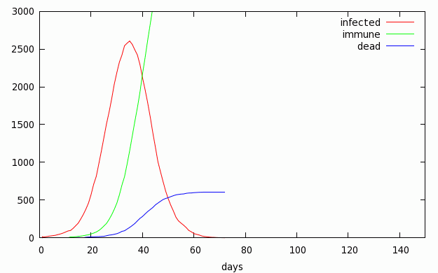
Number of infections against time. This is the classic bell curve, seen in real life and mathematical models.
This is not H1N1. The numbers aren't right. H1N1 is not nearly this lethal.
Notes:
The simulation works as follows: People are randomly assigned a mobility
(how far they travel each day) and a vulnerability (their chances of dying
if they get sick). Each day they move around. If they get too close to
someone sick, they may get sick, too, and infect others. After a week
they stay home, after 10 days they either recover or die.
For the second run, the 2000 most vulnerable people (out of 6500)
are vaccinated before the pandemic starts.
As the simulation is based on a random number generator, it gives different answers each time it is run (the animations above are always the same 2 runs). When no-one is vaccinated, the number of infections is large and the statistics are more predictable - the graph is always much the same size and shape. But when many people are vaccinated and fewer people get sick, the statistics are much more random. Sometimes the epidemic dies out in a few days, because the initial carriers do not infect enough new victims before recovering. Sometimes the graph has two humps as the disease dies away and resurges.
This simulation does not pretend to model a real disease; it's just for fun. One can try different strategies to combat the disease, e.g. vaccinate the more mobile carriers, or reduce the chance of transmitting disease on contact (e.g. hand-washing), or have people stay home earlier, and see what effect that has.
The spread of a computer worm is quite similar (e.g. Code Red in 2001. If a victim can infect more than one new person before recovering or dying, the disease will spread exponentially. If less than one, it will die out.
- the code (Perl; needs GD)